I BUILT LOOK BECAUSE SPOTLIGHT DIDN’T MATCH HOW I WORK.
📖 Full Documentation: https://noah-code.com/docs/look
An open-source, community-driven launcher for macOS. A lightweight alternative to Spotlight and Raycast.
Github: Repository
Some projects start from a big idea. This one started from a hundred tiny annoyances.
Open app -> Switch -> Search file -> Open Finder -> Copy something -> Paste the wrong thing -> Search again -> Open Terminal for one quick command. Go back.
Nothing was broken, but my attention kept getting sliced into small pieces.
After enough of those slices, even simple work feels heavy. I wanted one small window that could keep me in flow.
That window became Look.
And yes, I tried built-in tools first. Spotlight works for many people, but in my daily workflow I kept hitting the same friction:
- slower than I wanted when moving quickly
- ranking that often missed my actual intent
- no single place for app search, file flow, clipboard reuse, and quick utility actions
So this was not “reinvent for fun.”
It was a practical response to repeated friction.
The feeling I was chasing
I did not want the "most feature-rich launcher."
I wanted a launcher that feels:
- quiet: does not pull me into UI complexity
- fast: responds quickly enough that I trust muscle memory
- local-first: does not depend on cloud round trips for basic actions
- honest: predictable behavior, clear shortcuts, no mystery state
That is the core of look.
What look does in real daily usage
1) Search apps, files, and folders from one place
The default flow is intentionally simple:
- open launcher
- type
Enter
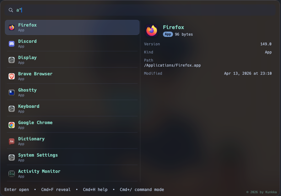
When I need precision, I use scoped prefixes:
-
a"term-> apps only (great when app names collide with file names) -
f"term-> files only (for docs, notes, exports) -
d"term-> folders only (for project navigation)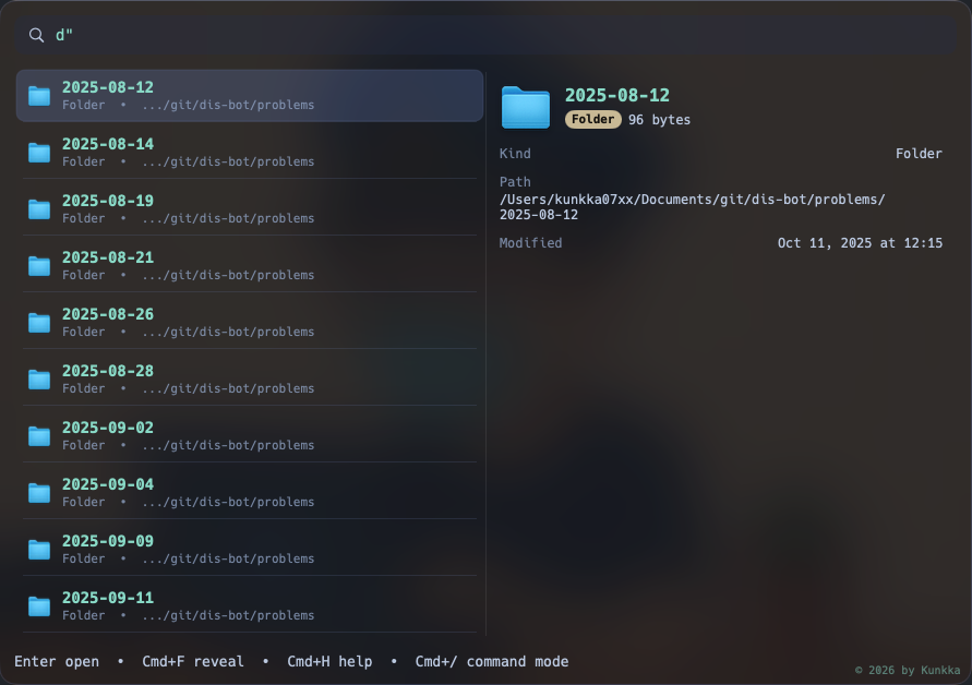
-
r"pattern-> regex (for structured matching)
This tiny prefix system sounds small, but in practice it saves a lot of "did I search the wrong thing" moments.
Path-style search also works (git/books-pc/readme style fragments), so navigation feels closer to how developers actually think.
2) Clipboard history that is practical, not gimmicky
Clipboard history is one of those features that either becomes daily muscle memory or gets ignored.
I built it to be useful in normal work:
c"-> show recent clipboard entriesc"word-> filter by remembered keywordEnter-> copy selected history item back to clipboard- delete in preview -> remove sensitive item from look history
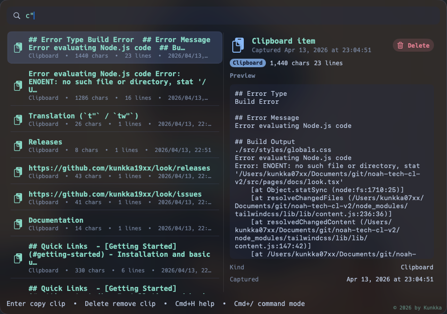
The right-side preview matters. I can inspect long clipboard content before reusing it, instead of guessing from a short line.
This sounds minor, but if you work across Slack/email/code/docs all day, it removes a lot of repeated re-copying.
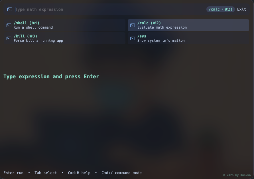
3) Command mode for utility actions in the same flow
Sometimes I do not want to open a new app for a quick operation.
Cmd+/ opens command mode.
Current built-ins:
calcfor quick expression checksshellfor short one-off command executionkillfor force-killing a stuck appsysfor a quick system snapshot
Keeping these inside launcher means fewer context switches and less "open this app for one tiny action" behavior.
4) Keyboard details that save time
These shortcuts are where the day-to-day value shows up:
Cmd+F: reveal selected app/file/folder in Finder at exact locationCmd+C: copy selected file/folder to pasteboard so I can paste directlyCmd+Enter: send current query to browser search when local result is not enoughCmd+H: open full in-window help for quick reminder
I also made sure the launcher does not keep aggressively forcing itself to front after opening another app, because that behavior breaks trust quickly.
5) Better behavior for Vietnamese typing
One personal quality-of-life detail: accented input.
I added normalization so matching is friendlier for Vietnamese typing patterns, including handling cases like đ -> d and combining marks.
Practical example: tẻrminal still matches Terminal.
It is a small implementation detail, but it makes the launcher feel like a tool for real people, not just demo text.
Under the hood: why this architecture
I wanted native UX quality and tight performance control. The project is split into three layers:
- SwiftUI/AppKit shell (macOS integration + interaction)
- Rust core engine (indexing, matching, ranking)
- FFI bridge (small stable boundary between the two)
.
├── apps/
│   └── macos/
│       └── LauncherApp/
├── core/
│   ├── engine/
│   ├── indexing/
│   ├── matching/
│   ├── ranking/
│   └── storage/
├── bridge/
│   └── ffi/
├── docs/
├── scripts/
└── assets/
This split helps in practice:
- UI iteration stays quick on native macOS side
- ranking/matching logic is testable and deterministic in Rust
- bridge API remains narrow and easier to reason about (
search,record_usage,reload_config,translate)
Ranking, relevance, and "why this result is on top"
Search quality is always the hardest part of launcher UX.
look currently combines multiple signals:
- exact/prefix/fuzzy text matching
- contains/token matching
- path-aware scoring
- result kind bias (app/folder/file)
- usage frequency and recency influence
Blank query has dedicated browse scoring so launcher is useful before typing.
One interesting real-world behavior: if a settings entry has been used heavily, it can stay high even when a new app was just opened. That is not random; it follows the current weighting model.
I added regression tests around these ranking edge cases after seeing them in real usage data.
Clipboard tradeoffs (the honest version)
Clipboard monitoring uses a lightweight polling strategy plus burst sampling for rapid copy sequences.
This gives a good responsiveness/performance balance, but it is still a practical engineering tradeoff, not a perfect event-capture system under extreme bursts.
I prefer this kind of explicit tradeoff over pretending something is "real-time perfect" when it is not.
Installation
Homebrew (Recommended)
brew tap kunkka19xx/tap
brew install --cask look
Update:
brew upgrade --cask kunkka19xx/tap/lookManual Download
Download the latest release from GitHub Releases.
Release builds are Developer ID signed and notarized, so normal first launch should open without Gatekeeper bypass.
Common install and first-run issues (please read)
Gatekeeper blocks first launch
Current releases are signed and notarized. Normal first launch should work without Gatekeeper bypass.
If macOS blocks launch:
- right-click
Look.app->Open-> confirm - or
System Settings->Privacy & Security->Open Anyway
Note: This is mainly for older unsigned builds. Recent releases should work normally.
Cmd+Space conflict with Spotlight
By default, Spotlight owns that shortcut.
To use Cmd+Space with look:
- open
System Settings->Keyboard->Keyboard Shortcuts...->Spotlight - disable or rebind
Show Spotlight search
Hotkey does not work after fully quitting app
Relaunch once:
open "/Applications/Look.app"Then hotkey behavior returns.
Configuration: users can tune a lot
I did not want a "my defaults are your destiny" app.
look supports both settings UI and config-file tuning.
Config file:
~/.look.config
Reload command:
Cmd+Shift+;
What users can configure:
- indexing roots/depth/limits (
file_scan_roots,file_scan_depth,file_scan_limit) - exclusion rules (
file_exclude_paths,app_exclude_paths,app_exclude_names,skip_dir_names) - privacy/network controls (
translate_allow_network) - backend logging level (
backend_log_level) - launch behavior (
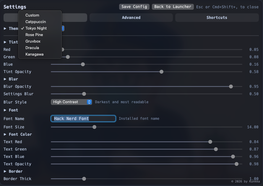
launch_at_login) - UI customization (tint, blur, opacity, font, border, background mode)
This is important to me because people work differently. Some want strict minimalism, some want broader indexing, some care deeply about visual tuning.
Closing
I built look because I was tired of losing focus to small, repeated friction.
This is still evolving, but it already gives me what I hoped for: less switching, less noise, and more actual work done.
If you try it, I would love candid feedback:
- where ranking feels great
- where ranking feels wrong
- what feature would make this your default launcher
Note: This article is a bit outdated compared to the current state of Look. Repo: https://github.com/kunkka19xx/look 📖 Full Documentation: https://noah-code.com/docs/look